Connor Boyle
Flipping Coins in 100,000 Universes Wouldn't Be as Close as the Polls in Wisconsin
by Connor Boyle
tags: politicsstatistics
I just read Nate Silver’s blog post, where he writes that pollsters are systematically altering their data to roughly match the average of existing polls. According to Silver, rather than releasing their findings as-is, they’re worried they’ll look uniquely wrong, and so they’re settling for blending in with the crowd. He infers this bias from the numbers that the pollsters themselves report; the margins in several swing states are too consistently close to be plausible, even if the election truly is a dead tie among decided voters.
Other than a passing mention of the binomial distribution, Silver doesn’t “show his work” with much detail. Since probability math can be really easy to get wrong (at least for me!), I thought I’d take a stab at trying the brute force option of simulating polls in a hypothetical dead tie, i.e. exactly 50% of decided voters plan to vote for each of the major candidates, Harris & Trump (I also happen to be a computer programmer by hobby and profession, so maybe I’m just a hammer looking for a nail).
This little project was made possible thanks to Nate Silver’s blog, Silver Bulletin, collecting and distributing poll results. Here are the data files containing the poll results that I used for Wisconsin, Pennsylvania, and New Hampshire.1
Simulating Wisconsin polls2
If the exact same number of likely or registered voters (depending on which poll) plan to vote for Harris as Trump, we
can easily simulate the act of surveying them by flipping a coin. Even more easily, we can run the random number
generator on my computer and checking whether the output floating point number is greater than 0.5; if it is, that’s a
Trump voter. Otherwise, that’s a Harris voter.
After we simulate our polls, lets extract our statistic of interest: the mean absolute margin. For example, if I have three polls with margins:3
\[\text{Trump} \space \text{+5%}\] \[\text{Harris} \space \text{+2%}\] \[\text{Harris} \space \text{+3%}\]then their absolute margins are:
\[\text{0.05}\] \[\text{0.02}\] \[\text{0.03}\]and the mean absolute margin for this universe of polls is:
\[\frac{0.05 + 0.02 + 0.03}{3} \approx 0.03333333333\]Here’s what the actual polls4 in real world Wisconsin done by real pollsters look like:5
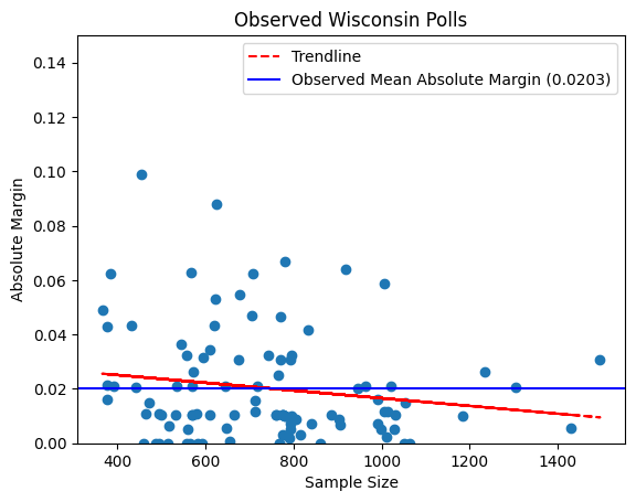
An average poll of Wisconsin has one candidate beating the other (some of them Trump beating Harris, some of them vice
versa) by about 2% (or 0.203 0.0203, as shown in the graph). While the trendline is not terribly strong, we do find that the
absolute margin of a poll goes down as sample size goes up, as we’d expect if the race were truly tied.
And here’s a simulation of what those polls could look like in an alternate universe where pollsters perfectly randomly sample the same number of people in a perfectly matched race between Donald Trump and Kamala Harris:
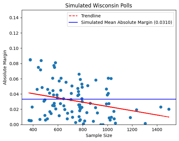
The output of this simulation certainly differs from our observed results–our mean absolute margin is a full percentage point higher than our observed one. That doesn’t prove anything on its own, though; maybe this simulation of the Wisconsin polls just happened to result in a high mean absolute margin by chance.
Simulating a multiverse of polls
What happens if we run that simulation many, many times, keeping track of the resulting mean absolute margin for each simulation? Let’s look at the histogram we get when we do that:
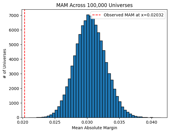
Whoa! Our observed mean absolute margin of polls (the dashed red line to the left) is way lower than any of the MAMs in the multiverse where Harris and Trump are neck-and-neck. In fact, the lowest MAM out of 100,000 simulated universes is 0.02092 or 2.092%, still 0.06 percentage points higher than our observed MAM. Does this mean something is wrong? Well, I can’t think of any way these polls could get consistently closer margins than our simulations while still remaining scientifically valid. It’s hard to get a low variance estimate of a mean without increasing your sample size; that’s why the sample size \(n\) is so important in scientific papers.
Recall also that we generously assumed the candidates had exactly even shares of decided voters. The more imbalanced the share of voters between the candidates, the higher we would expect the mean absolute margin to be. If you’re not convinced, look at this graph of simulations with varied shares for the candidates:
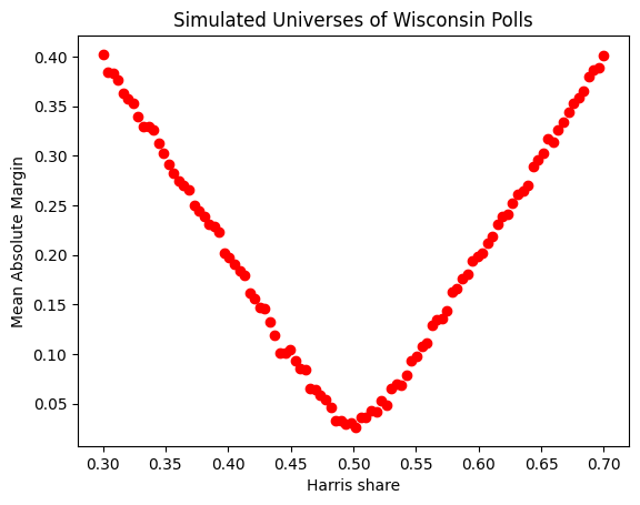
So, assuming the presidential race in Wisconsin isn’t exactly tied, the poll margins would look even more suspiciously close to zero than they already do!
With all that in mind, it seems hard to deny that there could be some systemic bias distorting these polls away from being true random samples of their populations–possibly herding driven by an aversion to publishing too strong of a poll for one or more of the candidates.
Some other states’ poll margins
Nate Silver noted that he observed herding in Pennsylvania as well, and our simulations reveal as much as well:
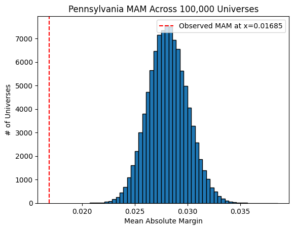
(the unnatural bias towards a tie looks even worse for Pennsylvania than it did for Wisconsin). However, the polls in New Hampshire apparently don’t suffer from herding:
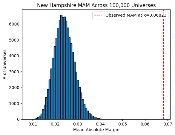
You can see that not only is the mean absolute margin for New Hampshire not well below (to the left) the simulation’s distribution, it is actually far above (to the right of) it. This makes sense; New Hampshire appears to be nowhere near tied, with nearly all polls giving a strong Harris lead. Note that our simulations actually wouldn’t be able to detect herding if its not occurring around a near-tie polling average; therefore all we can say is that Nate Silver could be right to acquit New Hampshire pollsters of the herding accusation.
How is this happening?
To be clear, no individual poll–even one with a very close margin–is by itself indicative of foul play by the pollster who created it. Rather, the aggregation of poll results for each of multiple swing states indicate systemic bias. I know almost nothing about political polls, but I recently read a great book about systemic problems in modern science called Science Fictions and it seems like there’s a lot of ways to manipulate your data–even without intending to or realizing that you are doing it.
It’s totally plausible to me that pollsters are just focusing a lot more scrutiny on any result that shows a strong swing toward one candidate or another; maybe they’re more likely to throw out outliers or keep collecting more data if they start to see “too” wide of a margin. These hypotheses may sound very foolish to people more familiar with how polls are typically conducted; I’ll stop speculating before I make too much of a fool of myself, but suffice it to say there are a lot of ways for data to get distorted in any field of science and I would expect no less of political polling.
Why does this Matter?
After election results (either from exit polls or counting the votes) are announced, it may turn out that one or more of the swing states goes to either Trump or Harris by a very wide margin. Some people might look back at these polls and conclude that they constitute evidence of interference, cheating, voter suppression, fraud, or the like. After all, the pollsters nearly all agreed that these swing states were right on the margin. However, the high level of agreement between pollsters is not evidence that we know what the results will be, but rather that we can’t trust these polls, and therefore should be very uncertain about the outcome of this race.
Footnotes:
-
I had to delete a row representing a YouGov poll from each of the Wisconsin and Pennsylvania data files. For some reason, these polls had their sample sizes listed as 0, which is both logically impossible and impossible to simulate. I don’t believe they could have made a significant difference; each one being only one of 134 (Pennsylvania) or 100 (Wisconsin) polls, these YouGov polls could have at most impacted the observed or simulated mean absolute margin by a 100th of their corresponding values. ↩
-
I used a Jupyter notebook to simulate these polls, which can be found here ↩
-
In order to simplify the problem, I transformed each poll into a strictly binary poll consisting of only those respondents who responded that they intended to vote for Trump or Harris. This introduces some numerical error, since we have to infer the number of strict Trump-&-Harris-only respondents by dividing by the sum of the percentages for each candidate. Out of generosity to the quality of the polls, we consistently round up the inferred sample size to the nearest whole number. ↩
-
This whole post rests on the assumption that the polls on Silver Bulletin represent well the full distribution of seemingly “good” polls. Since Silver is complaining about and drawing attention to herding among pollsters, I have assumed that he himself is not consciously or unconsciously selecting specifically for closer polls in swing states. But technically, he or his blog staff could be responsible for 100% of the apparent herding if they are doing this! ↩
-
This figure in a previous version of this blog post had the observed mean absolute margin at completely the wrong value (just in the chart, not in the text of the blog post). A helpful Redditor pointed this out to me and I corrected this around 2024-11-05T21:59 UTC.
I show the full, transparent edit history of my entire website on this GitHub repo.(EDIT 2024-11-16: I no longer do this; I’m currently figuring out a good way to show edit history without exposing my work-in-progress posts) ↩
Find me on:
Blog posts:
Hosted on GitHub Pages — Theme by orderedlist